COVIDSupport
SYNOPSIS
This was a classroom project for my HCI project class my Senior Year. We created this app to provide support for people diagnosed with COVID-19.
Our application system is primarily geared towards providing resources and support for those with COVID-19. We plan to fulfill this by providing five crucial functions and user-interactive support based on our contextual analysis and need-finding in the “field”.
TYPE
Classroom Project
TOOL(S)
Storyboarding, User Research, Wireframing, Figma, Usability Testing
Where it started
2020 and 2021 was a year of worry and uncertainty. The pandemic - the then novel Coronavirus (COVID-19) - had just begun, and to many people, like me, it was an unprecented point in time of our lives.
It went from something far, far away to something that affected the people around me, my peers, my family, and my friends. What affected me the most was the stigma surrounding COVID. I was more afraid of people knowing I got COVID than actually getting sick.
I realized that this was an area that was lacking. There were articles about how to cure the symptoms, how to get food, but none were about the impact COVID would have on mental health. In my HCI project class, my group and I decided to use our project as a way to explore how we can help people diagnosed with COVID through design-thinking.
Our Process
Our team prepared several interview questions, and conducted 4 interviews through Zoom. Our interviewees were mostly people in Vanderbilt University, or the VUMC Medical Center. Because we didn't have many users, our main focus was on discovering the pain points and day-to-day experience of being in quarantine.
From this, we discovered 5 key features that would support our users' needs.
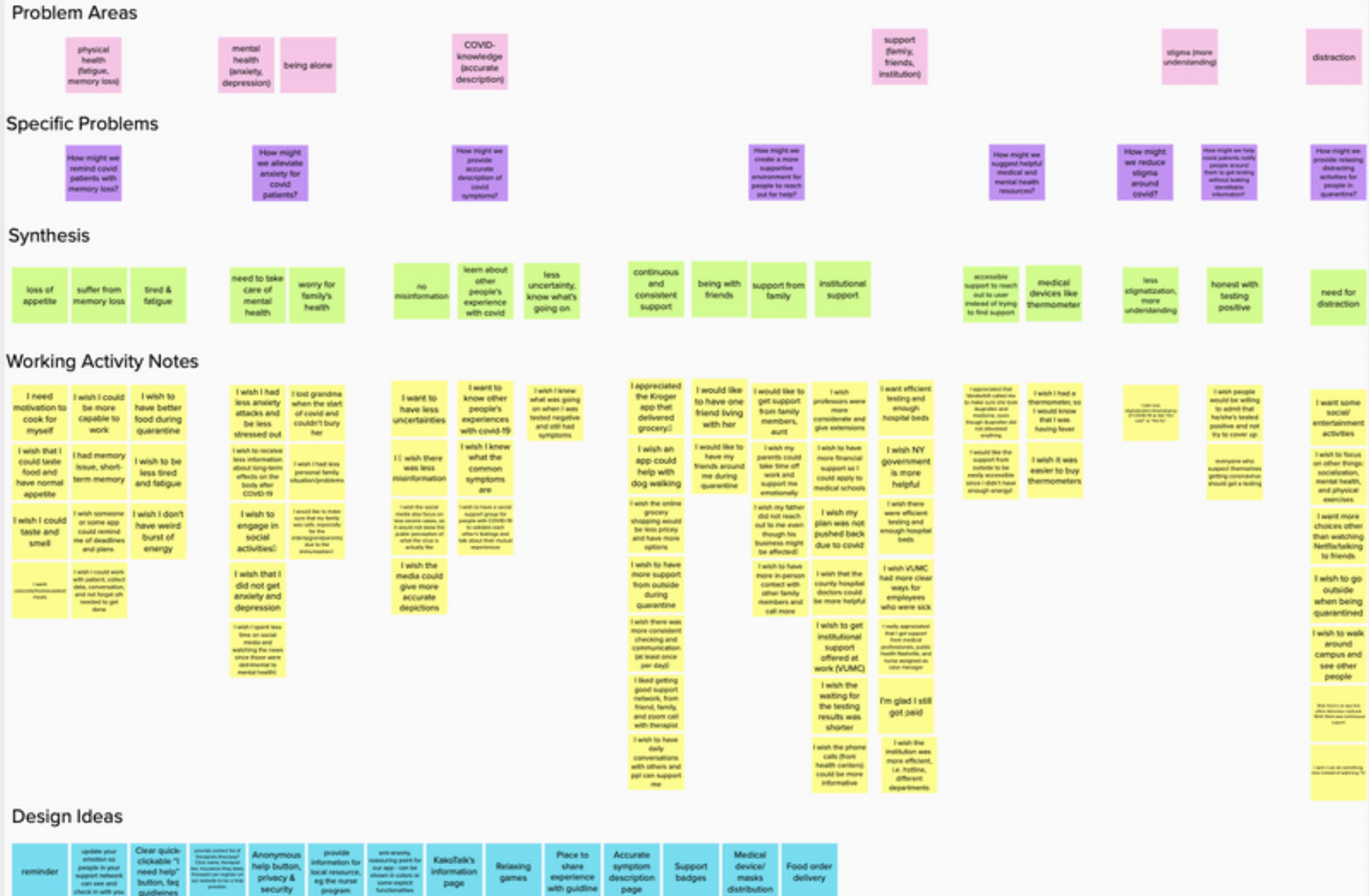
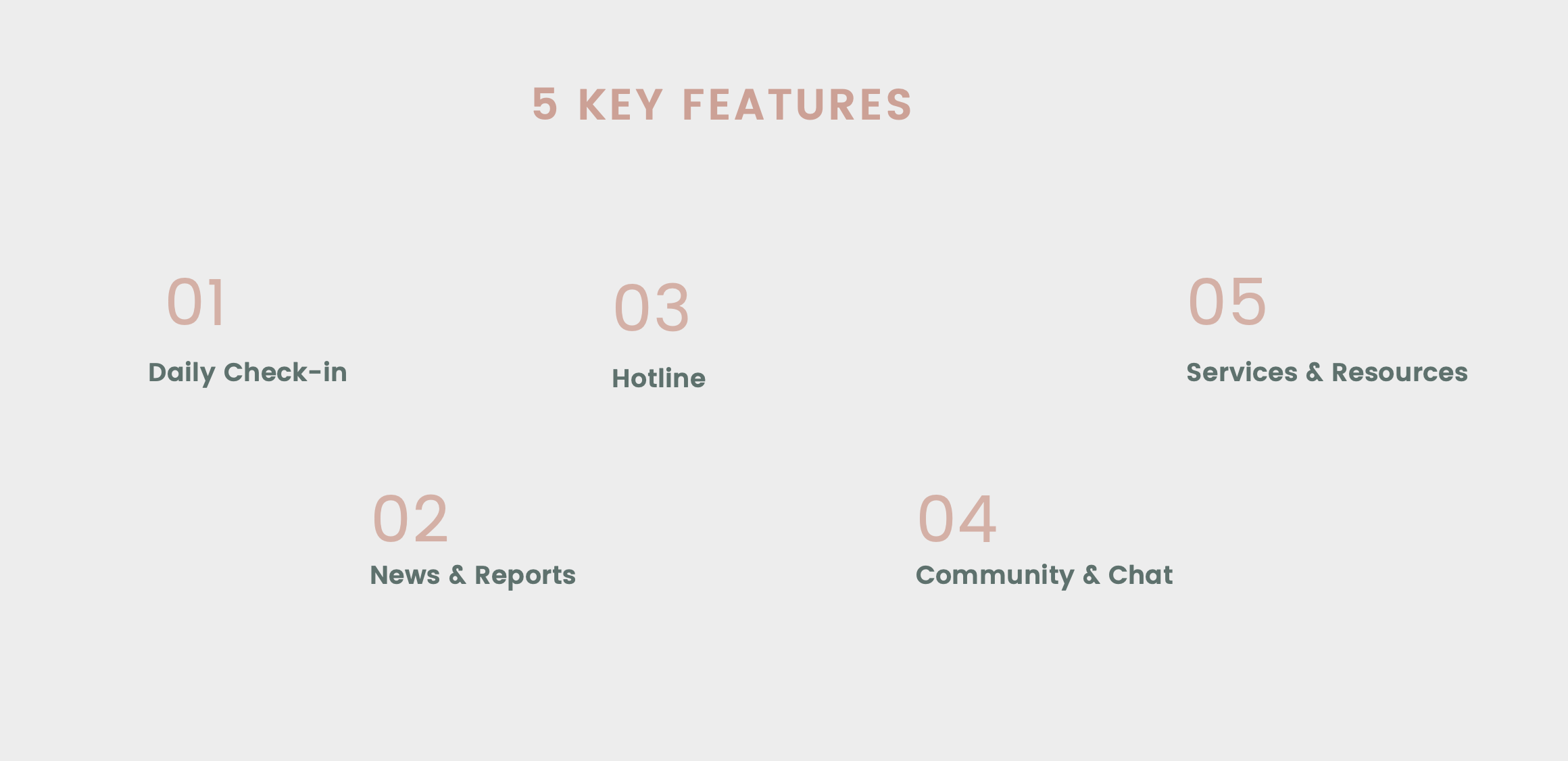
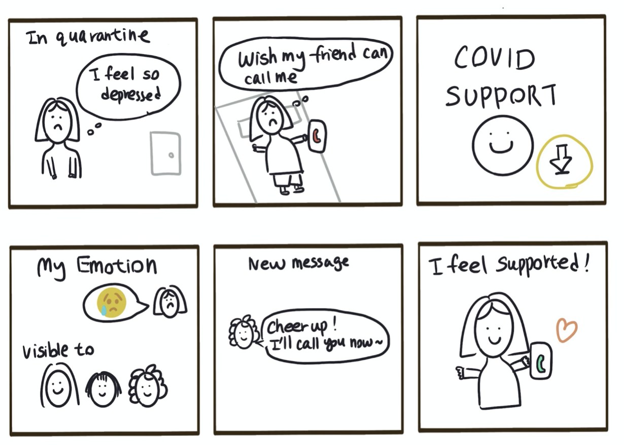
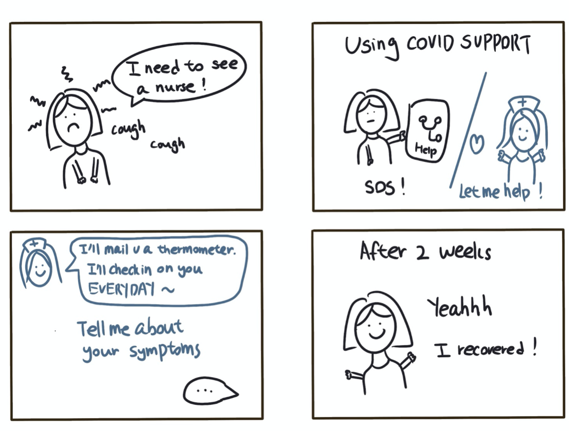
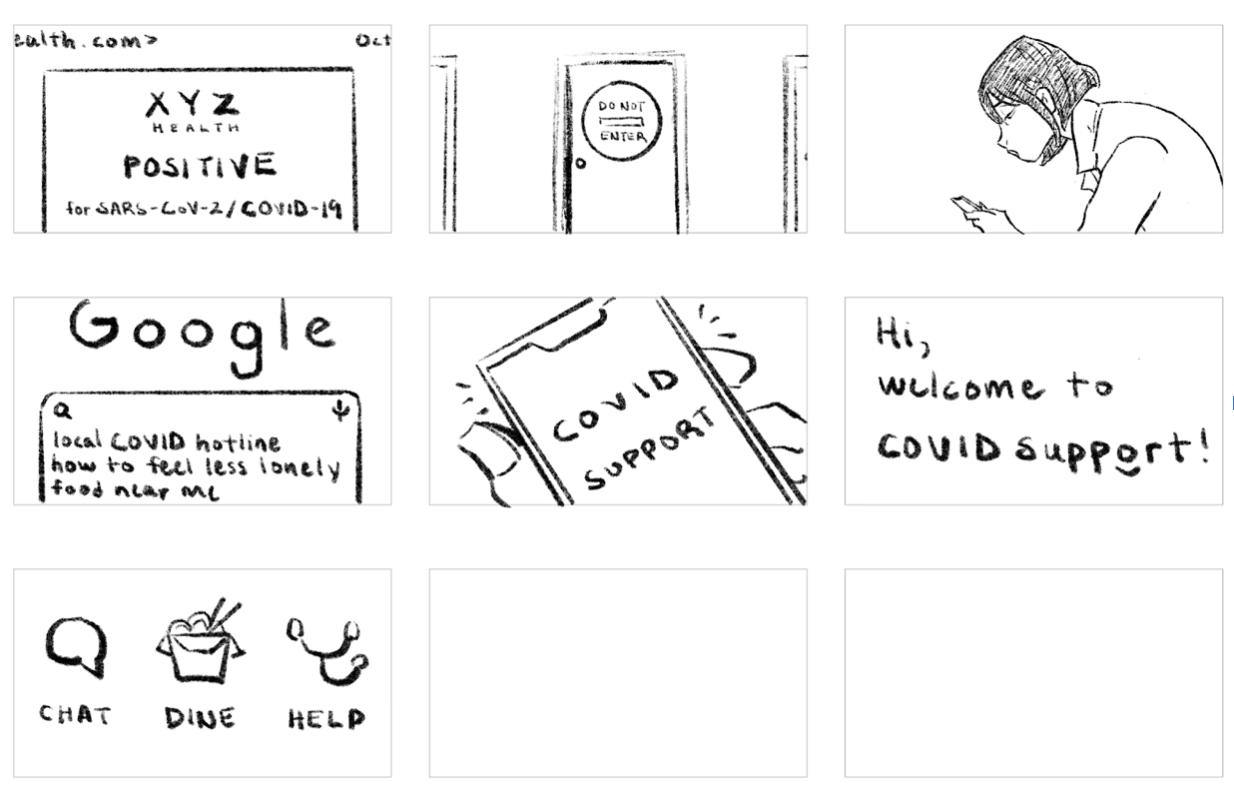
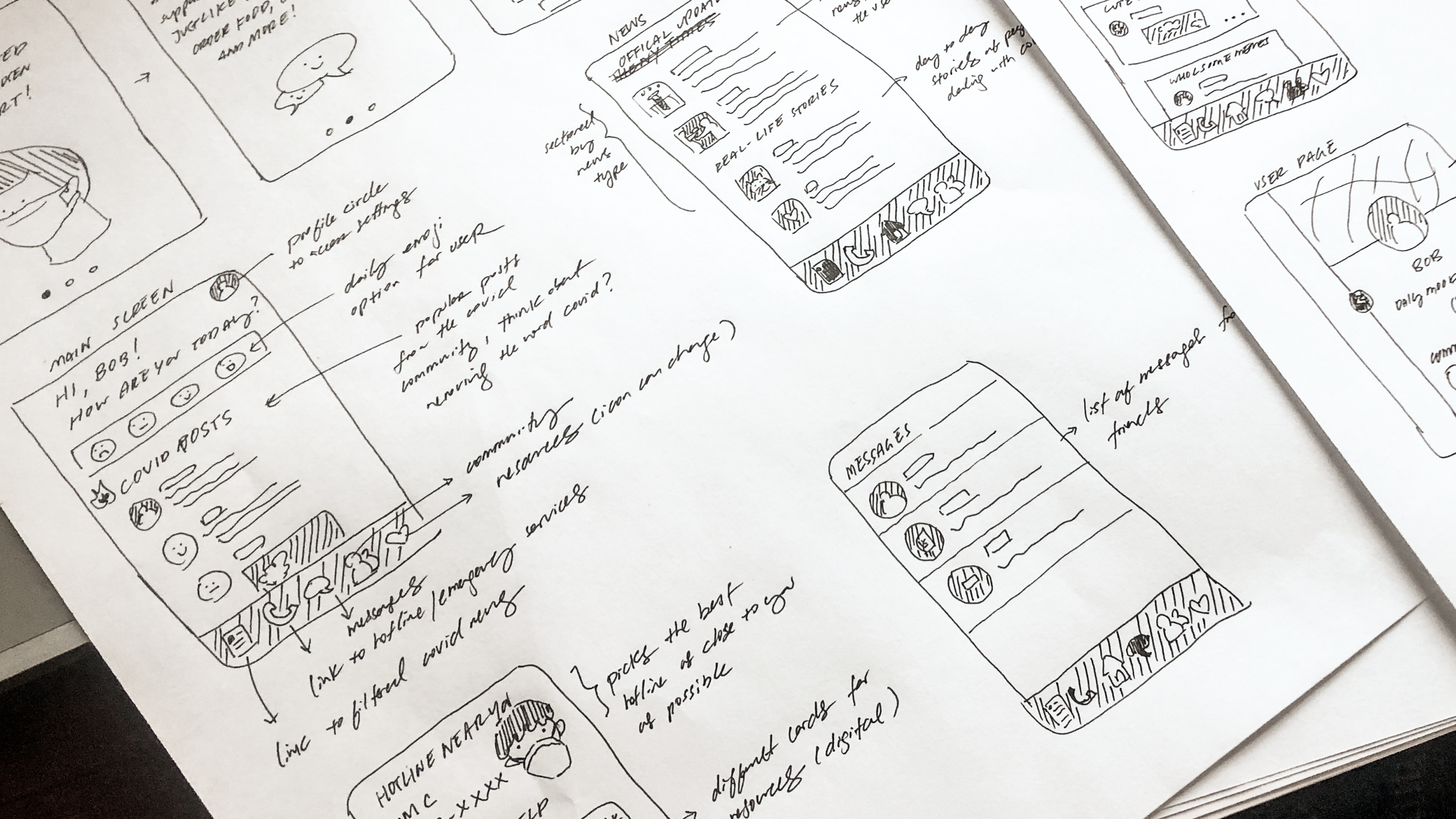
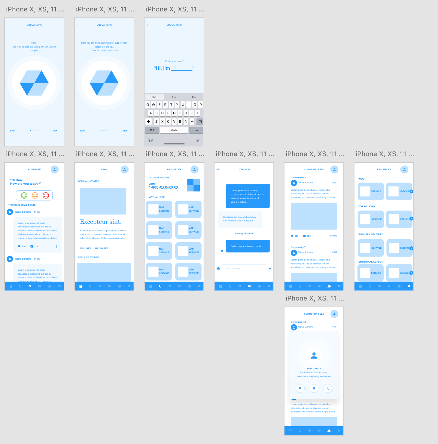
Storyboarding and Wireframing Process
From here, we started sketching, ideating, and wireframing based on our assumptions from the research.

Usability testing
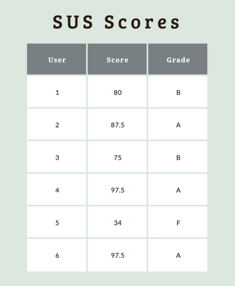
We interviewed six participants: past COVID-19 patients and false positives through an unmoderated study. We asked them to complete the following tasks:
1. Update your current state of mind to your friends and family members 2. Join a community of your choice
3. Dial your nearest hotline
4. Order a food delivery to your location
A year later....
A year out after graduation and into my new UX job, I stumbled back on this project while cleaning up my old Figma files. Looking back, I realized that there was a lot of potential in this app, and a lot of areas that I failed to consider in my first HCI project:
1. Accessibilty and contrast with alignment to WCAG 2.1 guidelines
2. Custom, consistent components in a design system
3. Design for mobile specific usability considerations.
A friend and I thought it would be an interesting project to revisit this based on what we've learned.
What I wanted to focus on the most was *delibrate design*. While we took feedback from our discovery sessions, we didn't ask ourselves further: "What does this mean?"
When the participans said that they wanted to feel more connected to a community, did that neccessarily mean a chat that we had to build natively within the application to connect them with new people? Or, did it mean that they were seeking support from people already in their life? Maybe our application should support them in other areas so that they could have the energy to facilitate these connections as per their needs.
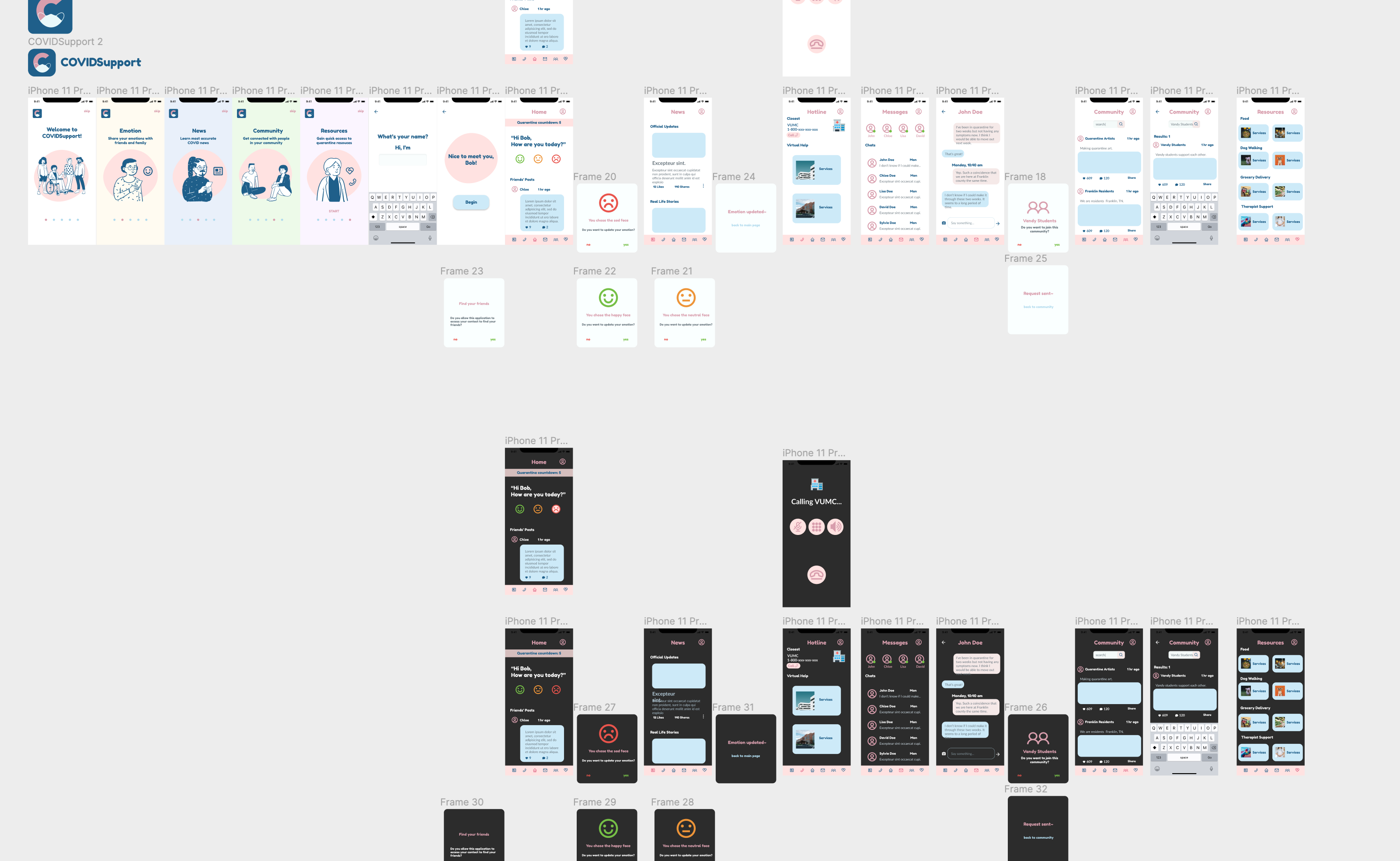
Design System
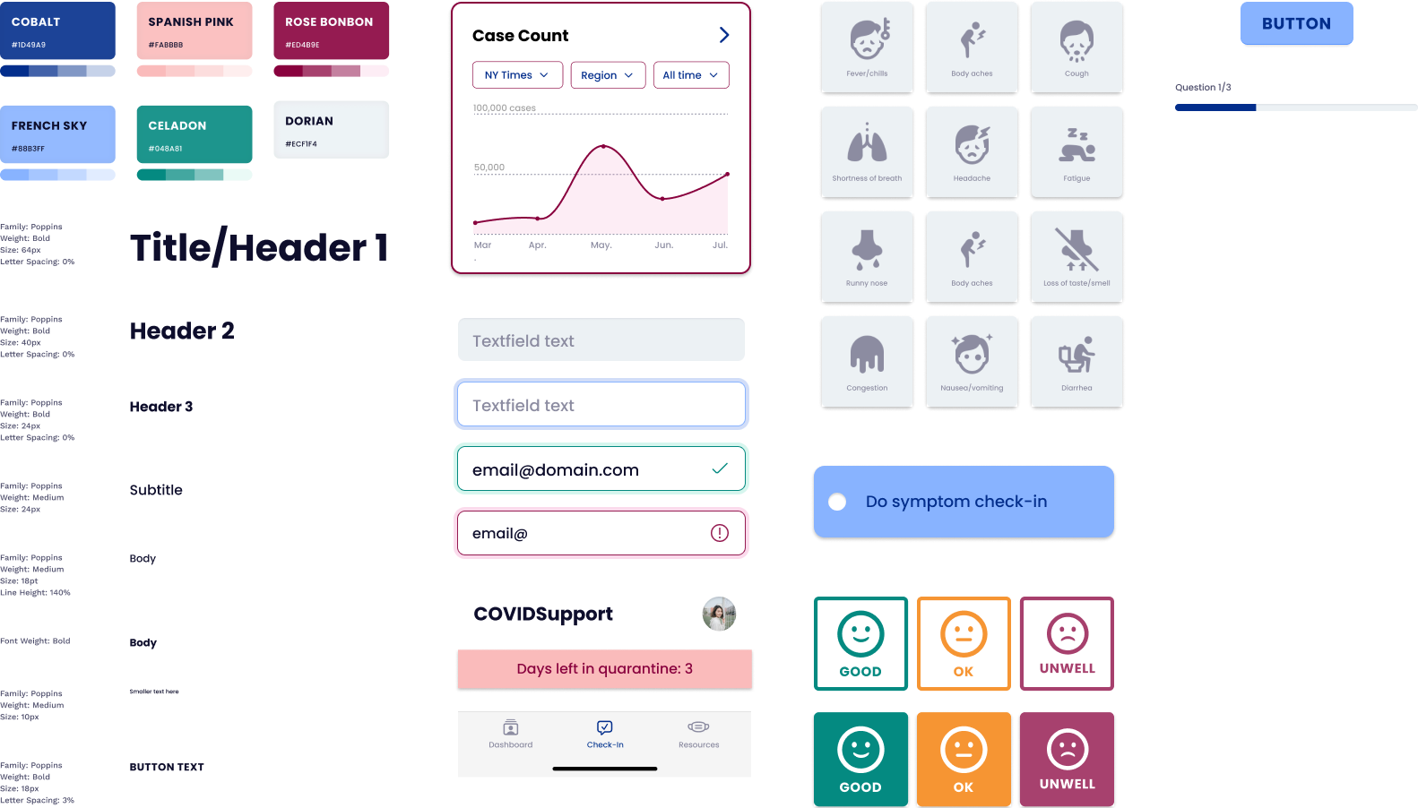
We started by building a design system. Doing this taught us a dew things. With a design system, we were able to not only ensure a more cohesive and delightful visual experience, but also maintain accessibility and responsiveness across our application.
Information Architecture
The second step we wanted to take was in redefining our information hierarchy. In our previous design, we had a very flat organization. We had a lot of capabilities (not all of which were necessary), some of which were difficult to find. With this design, we wanted to explore what was really important for our app: effective information, and communication.

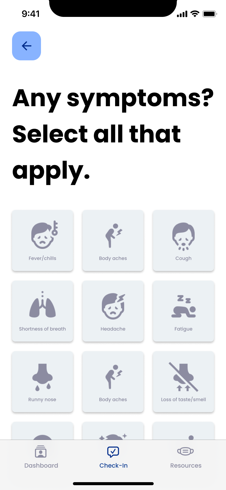

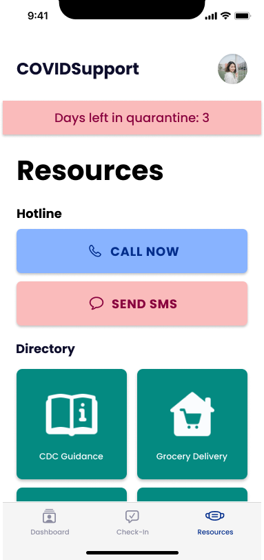

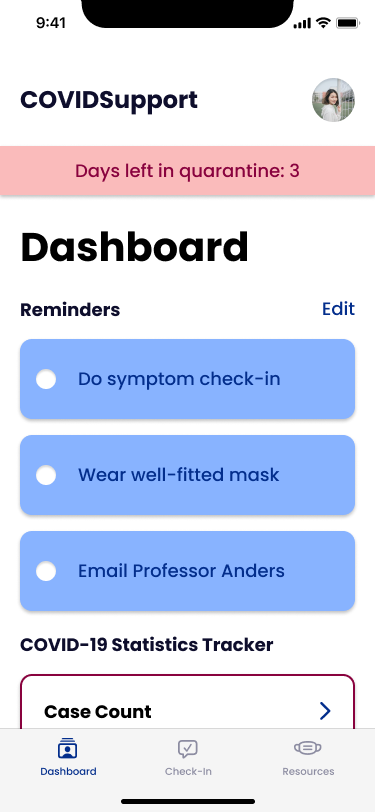
Re-design of our check-in, resource-hub, and news.
Touch-Specific Considerations
Finally, we wanted to address some of the mobile-specific improvements with respect to touch and screen real-estate. We found that as we went through the previous iterations (design-system, and information architecture), because we kept the mobile interface in mind, a lot of these considerations fixd themselves naturally. Here is an example of some of the thought process we went through as we simplified the capabilities of our application.

Where to next?
This project was challenging, but it was a nice way to look back and see all the ways that I've matured as a designer. I hope that in anoher few years, I can look back again on this and have new ideas, and more knowledge on how to make effective, emotional products to better people's lives.